Most apps lose people in the first week, not because of missing features, but because of friction. As an app UI/UX design agency that also builds and ships products, improveFX designs iOS and Android experiences around real user intent and then hands off engineering build-ready systems. You get mobile app UI/UX design services measured by retention and revenue, not applause.
Companies that chose us for their digital transformation



















No two apps start from the same place. Some teams have a validated idea and no screens yet. Others have a live product quietly losing users at onboarding. As an app UI/UX design agency, we scope UI/UX design for mobile apps around your actual situation, so you pay for the work that moves your numbers. Every engagement runs on the same research and handoff standards.

For products going from idea to first release. User research, flows, wireframes, and a complete iOS and Android UI kit your team can build from.

For live apps losing users or ratings. We find where people drop off, fix the flows behind it, and rebuild the interface without starting over.

For teams shipping features faster than design can keep up. Reusable components, tokens, and documented states ensure every screen stays consistent across iOS and Android.

For teams who suspect a problem but need proof. Heuristic review, moderated testing with real users, and a prioritized fix list you can act on.
Most app problems are not visual. They come from a flow nobody mapped, a state nobody designed, or a handoff that lost half the detail. Strong UI/UX design for mobile apps depends on six separate disciplines working together, and weakness in any one of them shows up in your retention numbers. Here is how our team handles each and what you receive from it.
We start by talking to the people who will use the app, not just the people paying for it. Interviews, competitor teardowns, and analytics reviews tell us which jobs matter and where the current experience breaks. You get personas, a prioritized problem list, and a documented rationale for every major design decision that follows. This is what separates app UI/UX design from decoration.
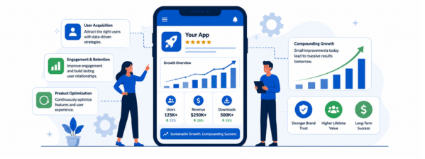
Before a single screen gets styled, we map how someone moves from opening the app to finishing what they came for. Navigation models, screen inventories, and end to end flows are agreed upon in wireframes, where changes cost minutes instead of sprints. Cutting steps out of a signup or checkout flow here is usually the highest return work in the entire engagement.
iOS and Android have drifted further apart than they have in years, and users notice when an app ignores the platform it lives on. We design to Apple’s Human Interface Guidelines and Android’s Material 3, adapting layout, typography, and controls per platform rather than exporting one file twice. The result feels native on both, which is what earns trust in the first thirty seconds.
Transitions, gestures, loading states, and empty states are where an app either feels responsive or feels broken. We design the moments between screens as carefully as the screens themselves, specifying timing, easing, and feedback so nothing leaves the user guessing. Every state gets designed, including the errors and edge cases most teams discover only after launch, when fixing them costs far more.
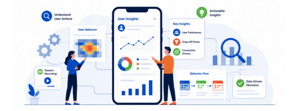
Accessibility is a design decision, not a QA ticket. We build to WCAG 2.2 AA from the wireframe stage: contrast that holds in sunlight, touch targets people can actually hit, labels screen readers announce correctly, and layouts that survive larger text settings. That keeps you aligned with ADA expectations, the European Accessibility Act, and app store review standards, while widening your audience.
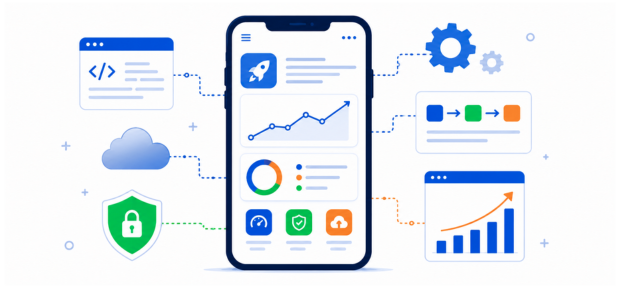
Clickable prototypes get tested with real users before anything reaches your backlog, so assumptions fail cheaply. Then we hand engineering a build-ready file: named components, design tokens, spacing rules, every state documented, and a walkthrough call to answer questions. Our developers work from the same files, which is why our mobile app UI/UX design work ships close to what was approved.
Get a free proposal with real numbers, honest timelines, and no lock-in. Judge us on that.
Design engagements go wrong when nobody knows what is coming next. Our app UI/UX design process runs in six stages, each with a named deliverable and a decision that belongs to you. Nothing moves forward without your sign-off, and you see work in progress every week rather than at the end. Timelines shift with scope, but the sequence does not.
We meet your team, agree on goals, users, constraints, and success metrics. You receive a written project brief and scope document, and you approve what we are solving before any design work begins.

Interviews, analytics, and competitor teardowns show where users struggle today. You receive personas, journey maps, and a ranked list of problems worth fixing, then decide which ones this engagement will address.

We structure navigation and map every flow in low-fidelity wireframes, screen by screen. You review the complete screen inventory and approve the structure while changes still cost hours instead of development sprints.
Two or three visual directions come first, then we design every screen in the chosen one, styled separately for iOS and Android. You sign off on direction before we scale it.

A clickable prototype goes in front of real users from your audience. You get recorded sessions, a findings summary, and the specific changes we recommend, with evidence behind each one.

Engineering receives documented components, design tokens, and every state, plus a walkthrough call. We stay available through the build, review the front end against the approved designs, and refine after launch.
A banking app and a food delivery app fail for completely different reasons. Regulation, session length, trust thresholds, and what users tolerate all change by category, so UI/UX design for mobile apps cannot run off one template. We have designed across these verticals, and the patterns below are what we bring in on day one.
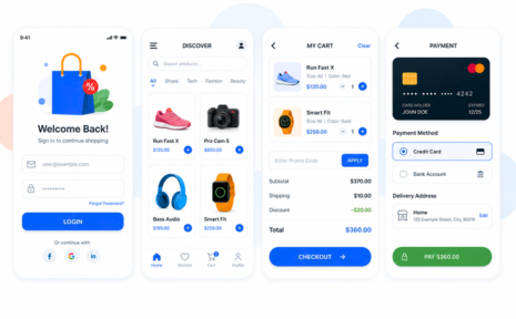
Money apps live or die on trust signals most teams underestimate: what a confirmation screen shows, how a failed transfer explains itself, and whether identity verification feels safe or invasive. We design consent flows, error states, and transaction histories that hold up under scrutiny, working within the PCI DSS and SOC 2 requirements your team already meets. Fewer abandoned verifications, fewer support tickets.
Patients use these apps when they’re tired, anxious, or in a hurry, often on an older phone. Clarity beats elegance every time. We design privacy-aware layouts, plain-language data displays, medication and appointment flows that survive interruption, and accessibility that meets real clinical needs. Work fits within the HIPAA obligations your organization carries, and completion rates rise on the screens that matter clinically.
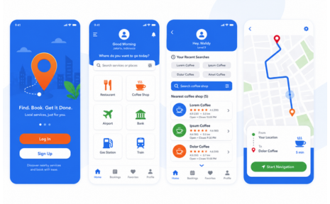
Mobile shopping is won in the four screens between browsing and payment. We design search and filtering that people can actually use with one thumb, product pages that answer objections before they form, saved payment and address flows, and returns that do not require a phone call. The measurable outcomes are add-to-cart rate, checkout completion, and repeat purchase frequency. None of it requires rebuilding your entire catalog experience.
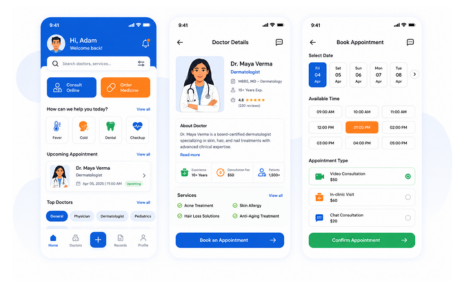
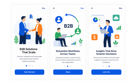
A mobile companion to a desktop product is not a shrunken version of it. We identify the few jobs people genuinely do on a phone, approvals, alerts, quick edits, status checks, and design those properly instead of porting everything. Role-based views, permission states, and offline handling get designed explicitly. Teams see higher mobile adoption and fewer requests to rebuild the whole thing later.
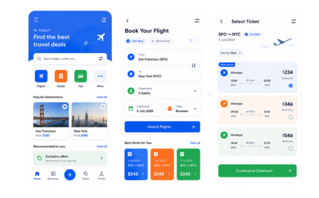
Two-sided apps mean two sets of designs, and the supply side usually gets neglected. Drivers, sellers, and providers work fast, outdoors, one-handed, sometimes with gloves on. We design both experiences: larger targets and glanceable status for the supply side, and clear pricing and live tracking for the demand side. Neglect either side, and the other one leaves. Balanced design is what keeps a marketplace liquid.
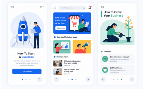
These apps get used in bad light, poor signal, and moving vehicles, which rules out most conventional design assumptions. We design offline-first states, high-contrast layouts that stay readable in sunlight, scanning and capture flows that tolerate one failed attempt, and status screens that answer the only question a user has right now. Reliability under bad conditions is the entire product experience.
Most design studios hand over a file and wish you luck. Whatever happens in the build, at launch, or three months later is somebody else’s problem. improveFX works as a mobile app UI/UX design agency and a development partner in the same team, which changes what we can promise. Here is what that looks like in practice.
A design that cannot be built on your stack or your timeline is not a good design, however it looks in a presentation. Our engineers sit in design reviews and flag effort, technical constraints, and third-party limits while changes are still cheap. You approve screens knowing they are buildable, which is why our design work rarely gets quietly simplified during development.
When design and development sit with different vendors, gaps become arguments, and you referee them. Bring us in for both, and one team carries the product from wireframe to App Store and Play Store release under a single contract and point of contact. If something is wrong in the shipped build, we own it. Accountability like that is hard to buy in pieces.
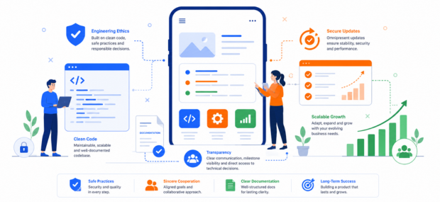
Design decisions show their real cost once acquisition spend starts flowing. Our teams also handle ASO, paid campaigns, and analytics, so we see which screens lose people after the install and what that costs per user. Those findings come back into the design, not into a report nobody reads. Very few design studios can close that loop, because very few of them see the numbers.
An app rarely arrives alone. There is a website sending people to the store listing, a landing page behind the paid campaign, and emails that need to look like the same product. These design services run on the same system as your app work, so nothing feels stitched together from different vendors.
When the same team designs your app, site, and campaigns, the components, tokens, and voice carry across. You approve a visual direction once instead of five times, and your brand stays recognizable whether someone meets it in the App Store or an inbox.
The site most people visit before downloading. We design it on the same component system as your app, so the experience feels continuous from first click to first launch.
A structured review of an existing interface. Useful before committing to a redesign, since it tells you which screens genuinely need work and which only look dated.
Where paid app install traffic actually lands. We design pages that match the promise in your ad and the interface people see after installing, which protects conversion rate.
Onboarding, re-engagement, and transactional emails carry a large share of retention. We design responsive templates that read cleanly on a phone and match the app they refer to.
App Store screenshots, launch assets, and campaign creative built from your product's real interface, so what people see in a feed matches what they get after installing.
The team that builds what we design. Native and cross-platform development handled in-house, which is why our designs ship close to how they were approved.
These come up in almost every first call. We have answered them the way we would on the phone, without vague ranges or language written to protect us. If something here does not match your situation, ask us directly, and we will tell you plainly whether we are the right fit for the project.