Every click costs you money, and what happens next decides whether that money comes back. Our landing page design and optimization work covers strategy, copy, design, build, and post-launch testing, so the page keeps earning instead of stalling. Designers and engineers sit in the same team, which means what you approve is exactly what goes live.
Companies that chose us for their digital transformation













A cold Facebook audience and a high-intent Google search need completely different pages, even when the offer is identical. One arrives curious; the other arrives ready to buy. Most agencies ship one template and hope. We build each page around its traffic source, its awareness level, and the single action that matters. Here are the four we build most often.

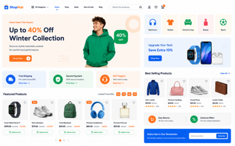
Built for Google Ads and paid social. We match ad copy to page headline, cut form friction, and support Quality Score with fast, relevant pages.

Made for online stores and product launches. Clear offers, trust signals near the buy button, and mobile checkout paths that do not lose people mid-scroll.

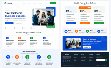
For demo requests, quotes, and consultations. We shorten forms, qualify better, and structure the proof so a stranger feels safe handing over contact details.

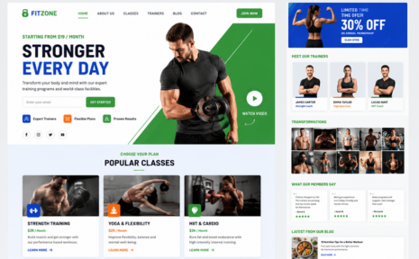
For free trials, webinars, appointments, and fitness memberships. We design the shortest honest path from interest to a confirmed booking or signup.
Across 170+ projects, the same handful of problems keep showing up. It is rarely the color of the button. It is usually a promise that changed between the ad and the headline, a form that asks too much too soon, or a page nobody opened again after launch day. Here are the six we find most often and what we do about each.
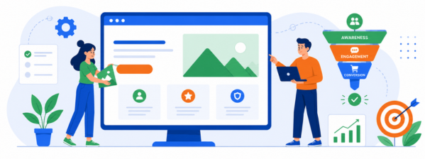
Someone clicks an ad for same-day installation and lands on a page about your company history. The mismatch registers in under a second, and they leave. We rebuild the top of the page so the headline repeats the exact promise that earned the click, in the same words. For paid search, that often means separate page variants per ad group rather than one page for the whole account.
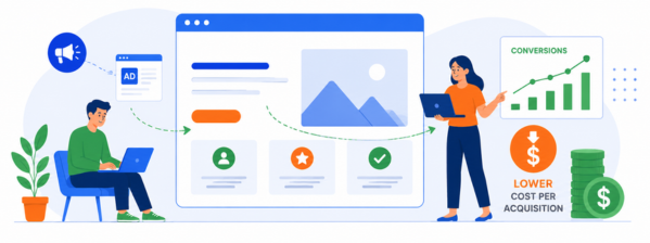
Most traffic is mobile, and most mobile users are on a middling connection in a moving car or a waiting room. A page that takes four seconds on a mid-range Android loses a large share of visitors before it renders. We compress and serve images properly, cut unused scripts, and test on real devices, not just a fast laptop on office wifi.
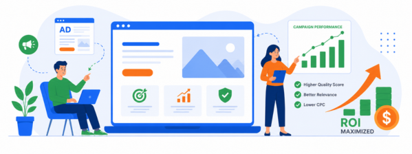
A landing page with full site navigation, a chat bubble, three offers, and a footer full of links is not a landing page. It is a small website. Every extra path is a chance to leave without deciding. We strip the page to one goal, remove competing links, and give secondary information a place to live where it cannot steal the click.
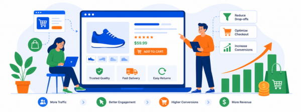
Nine fields for a first conversation is an interrogation. Phone number, company size, and budget are questions for the sales call, not the first click. We map which details you actually need to qualify a lead, move the rest to a follow-up step, and make the remaining fields easier to complete on a phone with one thumb. Fewer fields usually means more leads, and rarely worse ones.
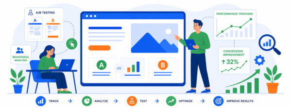
Testimonials parked at the bottom of the page arrive after the decision has already been made. Trust needs to sit next to hesitation. We place reviews beside the price, a guarantee under the button, security badges at the payment step, and a real client result next to the claim it supports, so doubt gets answered at the exact moment it appears.
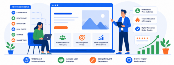
This is the most expensive one. A page ships, the campaign runs, and nine months later nobody can say which headline or form change would help, because nothing was ever measured. Our landing page design and optimization work continues past launch: events and heatmaps configured on day one, a monthly read of where visitors stall, and tested changes instead of opinions.
Get a free proposal with real numbers, honest timelines, and no lock-in. Judge us on that.
No black box, no month of silence, no surprise invoice. Every project runs on the same six steps, with a named deliverable and a date attached to each one. You will always know what we are working on, what we need from you, and when the page goes live. 95% of our projects ship on or before that date.

We review your current page, ad data, and competitors, then agree on one conversion goal, one audience, and one success metric. You get that in writing before anyone opens a design tool.

Copy and structure come before visuals. We write the headline, offer, and objection order first, then wireframe around them, so the design supports an argument instead of decorating an empty one.

You see the mobile layout before the desktop one, because that is where most of your traffic is. Two rounds of revisions are included, and every screen is reviewed against the brief.
Our own developers build the approved design on WordPress, Shopify, Webflow, or custom code. No handoff gap, no rented page builder, and you own every file when we hand it over.

Before go-live we set up GA4 events, heatmaps, and form tracking, then test speed, forms, and accessibility across real devices and browsers. Nothing ships until the numbers can be read from day one.
We read the first weeks of real behavior, find where visitors stall, and test specific changes. Most clients see the biggest gains here, not on launch day. This step is where design becomes optimization.
Ask us these six questions, then ask every other agency on your shortlist. The answers separate people faster than a portfolio does. Ours are below, including what happens when a page misses its target, which is the one most landing page design and optimization services would rather you did not raise.
A test needs enough traffic to mean anything. Below roughly a few hundred conversions a month, an A/B test tells you noise, not truth, so we say that instead of billing for it. At that volume we make evidence-based changes and measure the before and after. Above it, we run one hypothesis at a time, to significance, and document what we learned either way.
Speed is a number, not an adjective. Every page we ship targets a Largest Contentful Paint under 2.5 seconds, Interaction to Next Paint under 200 milliseconds, and near-zero layout shift, measured on a throttled mobile connection rather than a desktop on fiber. If a font, script, or tracking pixel breaks that budget, it does not go on the page without a conversation about the trade-off.
Every page is built to WCAG 2.2 AA: readable contrast, labeled form fields, visible focus states, working keyboard navigation, and sensible heading order. This matters for the roughly one in four US adults living with a disability, and it reduces ADA exposure for you. It is included in the build, not quoted as an add-on later. Accessible pages also tend to convert better, because clarity helps everyone.
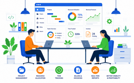
Before launch, we configure GA4 conversion events, form submission tracking, call tracking where relevant, and a heatmap or session recording tool. You get access to all of it in your own accounts. After launch, you receive a short monthly read: what changed, where visitors drop off, and what we recommend testing next. No dashboard you cannot log into, and no report that hides the uncomfortable numbers.
We build on platforms you already pay for: WordPress, Shopify, Webflow, or your own codebase. If you would rather use Unbounce or Instapage, we will, but we will tell you first what it costs to leave. At the end of a project, you receive the design files, the code, and admin access. Nothing is held back as commercial leverage.
We agree on a target before we start, based on your current rate and the traffic source, not a number we invented. If the page underperforms after a fair testing window, we keep working on it. That has meant new headlines, a restructured offer, and on two occasions a full rebuild at no extra design cost. It is the reason our average client stays 1.6 years.
Design is one of nine things improveFX does. The same in-house team also provides organic SEO services, manages ad accounts, and ships custom software. That changes what we notice when a page underperforms and what we can fix without bringing in a third party. Here is what it means for your project.
Our SEO and paid media teams work alongside the designers. When a page underperforms, we can look at the search terms, the ad copy, and the audience settings as well as the page itself. Sometimes the fix is the headline. Sometimes it is a keyword match type or a bad placement, and we would rather tell you that than redesign something that was already fine.
A form that emails someone is the easy version. We also build pages that route leads by zip code, book into a live calendar, price a quote in the browser, or push straight into your CRM. Because our website and landing page design services run through the same engineering team, integration work does not become a separate project with a separate quote.
improveFX has delivered 170+ projects for 120+ clients, and the average client stays for 1.6 years. Landing page work has run across ecommerce, SaaS, healthcare, fitness, home services, and B2B. That range matters, because a page selling a $40 impulse buy and a page selling a $40,000 contract are built on completely different logic. We have built both more than once.
A landing page rarely arrives alone. The ad creative that drives traffic, the follow-up email that lands after the form, and the site the visitor checks before they trust you all have to look and sound like the same company. These are the design services our landing page clients most often add.
If traffic is already arriving and not converting, start with a UI audit. If the whole site feels older than the new page, start with website design. If you are running campaigns, email and ad creative usually pay back fastest. We will tell you honestly which order makes sense.
A structured review of an existing page or site: where users hesitate, what the data says, and a prioritized list of fixes ranked by likely impact and effort.
When the landing page converts but the main site loses people, the problem moved. We redesign the pages your visitors check before deciding, using the same conversion logic.
Few leads convert on the first visit. We design responsive email templates that carry the landing page's offer, tone, and design into the inbox and the follow-up sequence.
The ad creative and the landing page should feel like one message. We design scroll-stopping visuals for Meta, LinkedIn, and Instagram that match the page they lead to.
If your landing page sells a product people then use, the experience after signup decides whether they stay. We design mobile and web app interfaces around that first week.
Already have designs or a Figma file from another team? Our engineers build it as a fast, tracked, fully responsive page on your existing stack, no redesign required.
These are the questions that come up most often on first calls, answered the way we would answer them on the phone. If yours is not here, ask it directly. We would rather have an awkward conversation before a project than a surprise in the middle of one.